Onboarding for Data Science at Civis Analytics:
A data-driven UX project
Problem: How can we make Civis, a complex and powerful data science platform that requires advanced skills to use, simple for new users to learn?
Approach: Through interviews with users, multiple rounds of testing, and iterating on several different design ideas, come up with a user-centered onboarding process that builds confidence in new users without slowing down more advanced ones.
Solution: A walkthrough tutorial where we provide sample data that allows users to test all areas of the platform in a no-risk environment.
A couple of summers ago, I served as a UX/Product Design intern at Civis Analytics, a data science company with its roots in predicting voter turnout for Obama’s two presidential campaigns. I was drawn to Civis because we share progressive values, interest in nonprofit work, and a background in organizing and politics, so I figured I’d be a good fit.
However, there was one thing that the staff at Civis and I did not share when I started: any knowledge of data science whatsoever. I had not created so much as an Excel pivot table at the time I started here, so I spent my first weeks learning as much as I could from the data scientists and applying my communications and visual design skills to help out with the product launch that coincided with my second day on the job.
In hindsight, I’ve come to believe that my position as a total beginner in the data science domain was, in a way, an asset. Where most designers following a user-centered design path have to work hard to remove their own hunches and biases from the process, I was a totally clean slate. You can’t overrun research with your own opinions if you haven’t formed any.
Step One: Discover
During my internship, Civis was in the middle of expanding from a consultancy into a company that also makes and sells a product. Part of this process involved empowering the users to dive into the platform on their own (no easy task given the technical complexity of data science), cutting down on the time the support team needs to spend with each customer, and making their technology scalable. So, Kate (my fellow intern in the project management track) and I came together to build a tool to help users get themselves up to speed with the data science workflow.
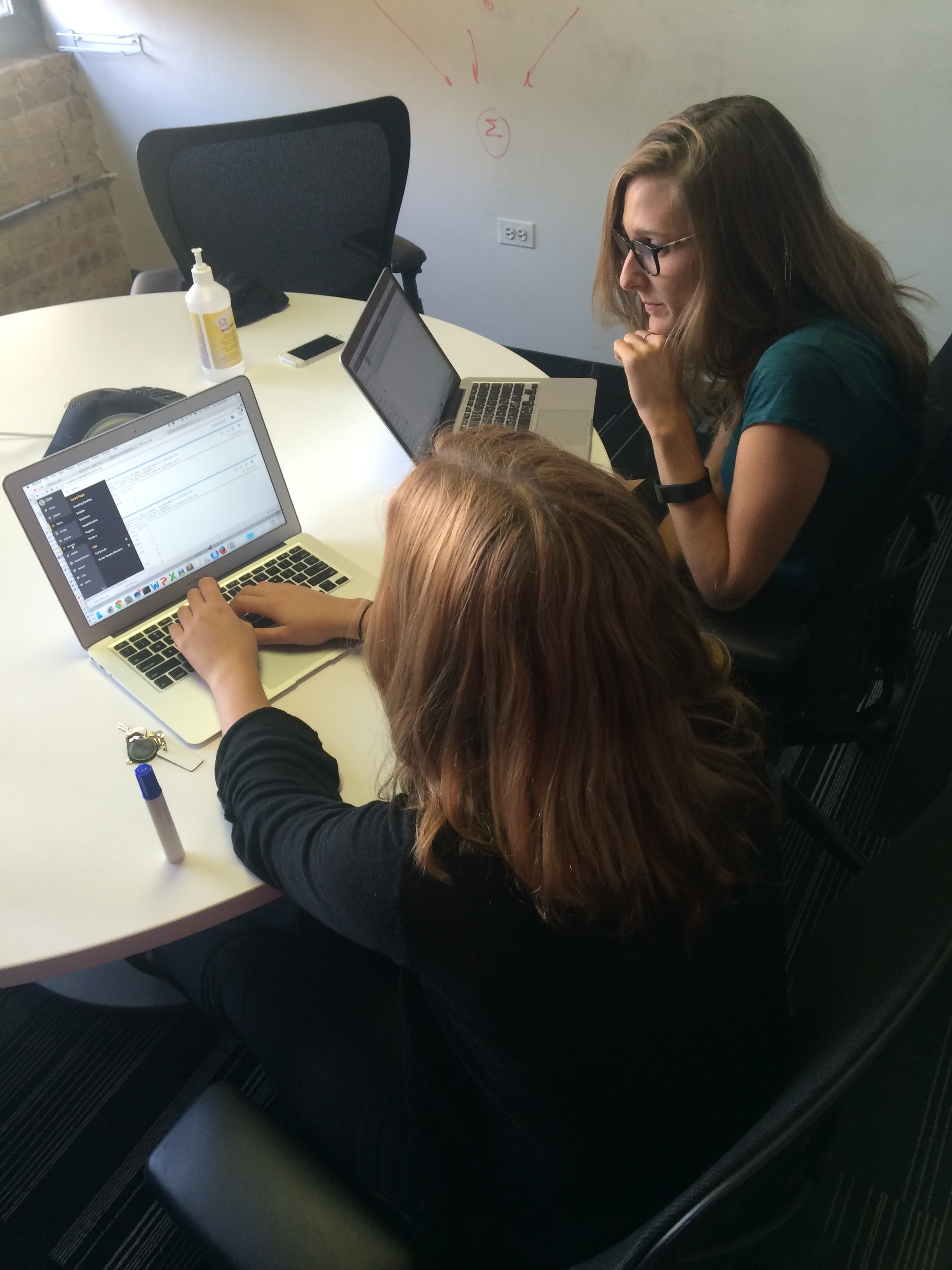
Kate shadows a user.
Our first step was to conduct independent usability studies, using sample data and a list of set tasks to make a heuristic evaluation of the existing platform. We made it through with some difficulty, taking pages and pages of documentation of usability issues and roadblocks, and learning a little SQL on the way. We used the results from this stage to define and inform our next steps: user interviews and shadowing.
Step Two: Define
After going through these tasks with a variety of users (data scientists who use the platform for their own daily work and members of the support team who train new clients on the platform) we synthesized their feedback into a journey map.
We started by creating a physical map of users’ path through the platform, including all of their detours, shortcuts, and desire paths. We created sticky notes of their comments during testing and color coded them into things people said, thought, did, and felt along the way.

Color-coded postits show we mean business.

Scripts: many enter, few escape.
Journey mapping was invaluable in helping me pinpoint problem areas in the platform, especially given my initial lack of experience in the domain. Once the arrows and sticky notes were up, it was easy to identify places where people hit dead ends, synthesize platform-wide issues that came up repeatedly, and distinguish minor irritations from serious roadblocks.

Feedback: It’s important.
Kate and I came to realize that almost all of the users we tested ended up asking “What am I supposed to do next?” at some point in the testing, spending valuable time searching for the right path. This led us to the conclusion that some sort of interactive tutorial for new users might be one solution to the onboarding question.
Step Three: Design
To tackle this, we did a Google design sprint (similar to what I did on a previous project), allowing us to spend a week quickly brainstorming ideas, testing them, iterating on those results, and testing them again. I love these sprints because they’re a great way to find out if an idea has legs without devoting tons of time and resources to them [and because they feel a little bit like summer camp. (I went to dorky summer camp)].
My first step was to quickly sketch out some possible shapes our tutorial could take.
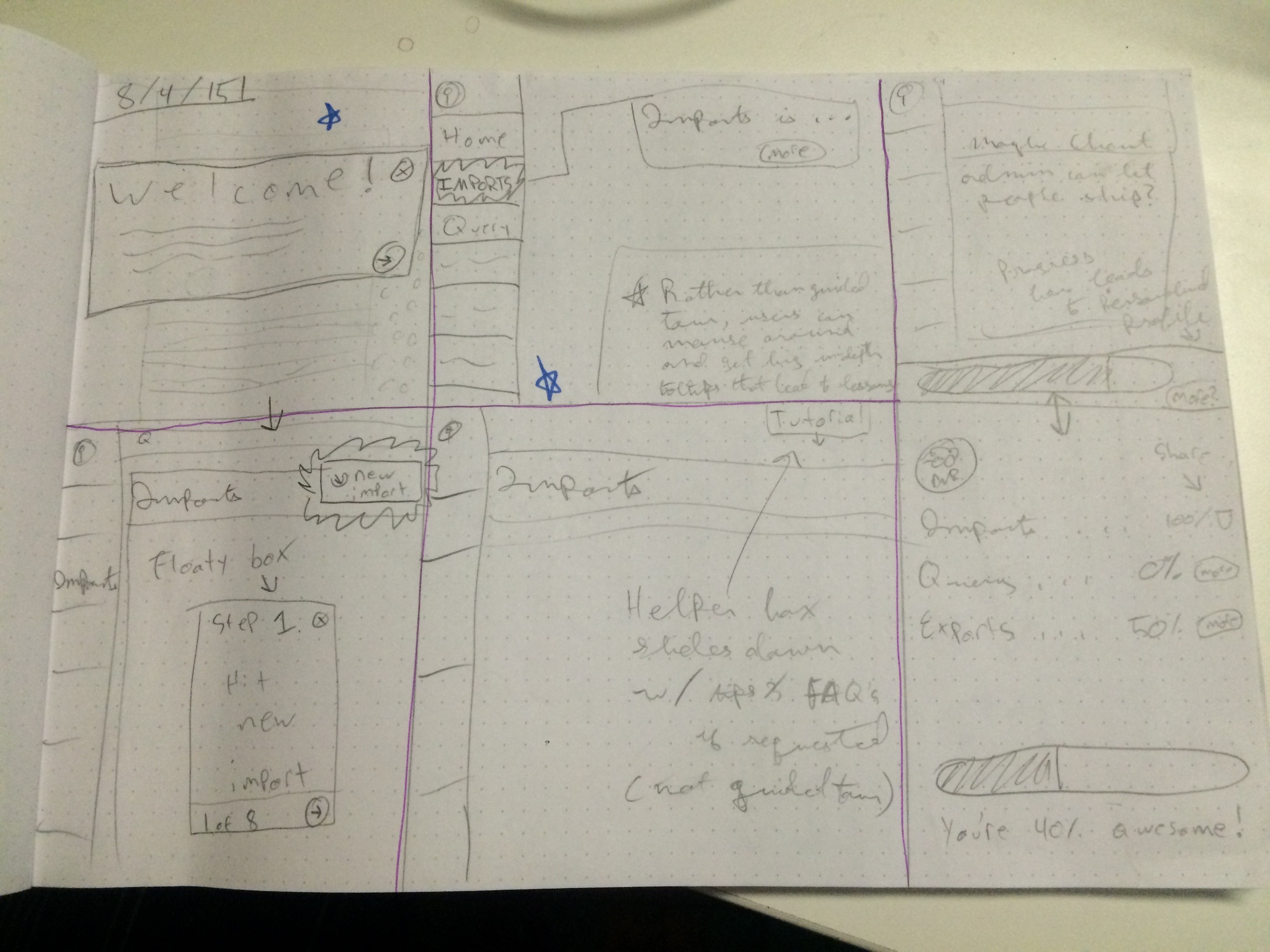
Sketches
From there, we narrowed our ideas down to two basic paths: an interactive, guided tutorial, or a more user-directed series of tooltips that people could explore at their own pace. I spent most of a day mocking up a few screens of each of these options.
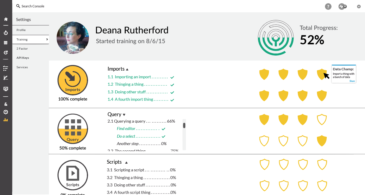
I’d honestly expected the data science experts we tested to get annoyed with the guided tutorial, thinking that the hand-holding might hold them back. But to my surprise, several of them got excited about the mockups, telling us that they would have appreciated such a tool when they first started at Civis. People also thought the tooltips would be helpful at some point in the future, but the comprehensive walkthrough definitely generated more excitement, so we pursued it further. I also added a linked dashboard screen so people could easily track their progress and get back to areas in the platform where they might need more instruction later.

Tooltips

Guided Tour

Progress
Informed by more user testing, I continued creating additional screens of the walkthrough while Kate wrote the first draft of the copy and rigged up a clickable prototype in UXPin. I am a huge fan of clickable prototypes: there’s nothing like being able to give testers a real sense of how it will feel to use a new tool without having to code the whole thing out. In my experience, low stakes encourage creativity and the kind of risk-taking that leads to interesting solutions.
Step Four: Evaluate (and start the cycle again)
User testing our last step of the sprint was immensely gratifying. We walked in wanting the testers to tell us what was wrong with what we’d built, but the feedback was overwhelmingly positive, focusing instead on how we could expand the project. This step totally validated the time and effort we’d spent on testing–we had clearly built something that could work for our users and add real value to our product, because we listened to what the users needed and always designed with them in mind.
At the end of our sprint week, we had the opportunity to present our work to the whole staff, giving a quick crash course on the basics of user centered design, taking them through our process, and, finally, presenting the prototype.
In the days after the presentation, multiple engineers and data scientists approached me and Kate to give us more input and encouragement and ask interesting and challenging questions. There was still a lot left to do–working with the tech team to break this into manageable chunks that they can start building, figuring out how to keep the tutorial up-to-date as the platform grows and changes, turning our sprawling whiteboard journey map into something that the rest of the organization could read at a glance–but I felt great about what we accomplished.

Presenting to the staff.
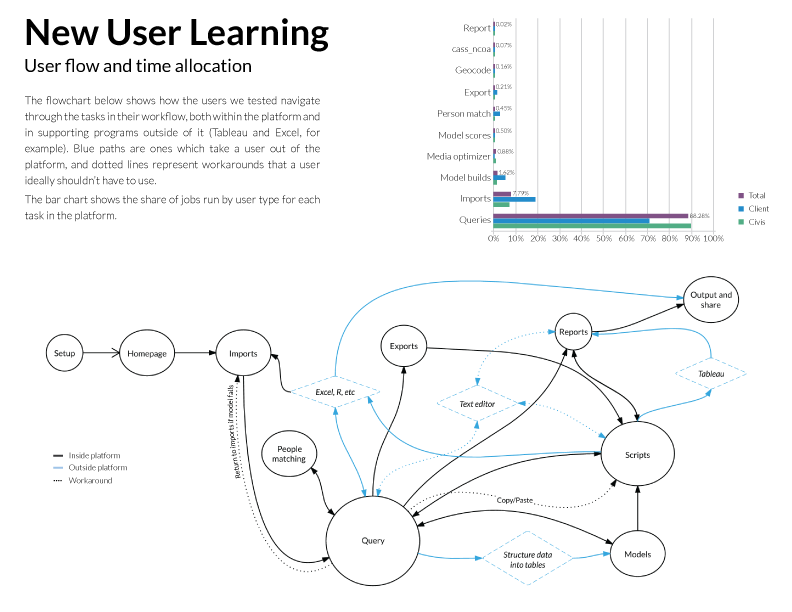
Update:
We took our journey map and our many pages of notes and turned them into something that Civis can use as it improves the platform going forward. Kate did the Excel work and I did the design.